

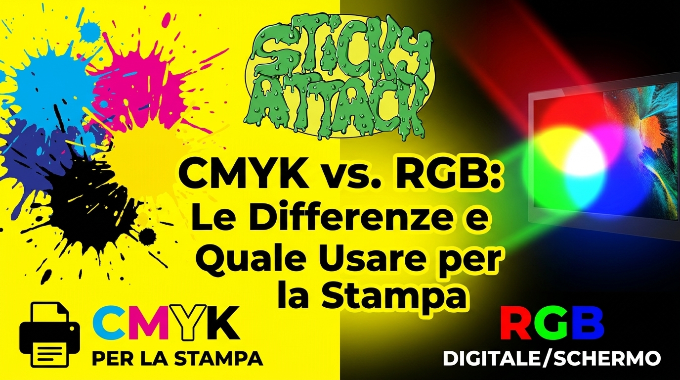
CMYK and RGB are the two ways colors are created. RGB it is made of light and lives on screens; CMYK it is made of ink and lives on paper. The rule of thumb is simple: if your design is going to screen, use RGB, if it’s going to print — a sticker, a label, a flyer — use CMYK.
Behind this difference is the reason why a bright color on the monitor comes out duller once printed. Understanding why avoids unpleasant surprises and files to redo.
| RGB | CMYK | |
|---|---|---|
| Made of | Light (red, green, blue) | Ink (cyan, magenta, yellow, black) |
| Method | Additive (light is added) | Subtractive (light is subtracted) |
| Where he lives | Screens: monitors, smartphones, TVs | Printing: paper, stickers, packaging |
| Color range | Wider, bright shades | Narrower, softer shades |
| When to use it | Web, social, video | Anything to print |
What is RGB model
RGB stands for Red, Green, Blue (red, green, blue). He’s a model additive: starts from black (absence of light) and adds the three colors of light to create all the others. At maximum intensity, the three together give white.
All devices that emit light use it: monitors, televisions, smartphones, cameras, projectors. Each pixel on the screen is made of three dots – one red, one green, one blue – which, changing intensity, form the image.
The advantage of RGB is the very wide color range: Produces neon greens, electric blues and bright oranges that look vibrant on the screen.
What is CMYK model
CMYK stands for Cyan, Magenta, Yellow, Key black (cyan, magenta, yellow, black). He’s a model subtractive: starts from the white of the paper and adds inks that absorb (subtract) the light. The more ink you put in, the darker the color becomes.
Cyan, magenta and yellow together do not give a solid black, but a dirty brown. This is why we add the black (the “K”, called Key): is used for clear texts, contrasts and deep shadows.
CMYK, also called four-color process, is the standard of all printing companies: digital printing, offset, packaging, labels and stickers pass through here.
Because on the screen the colors are brighter
Here is the point that generates the most disappointment. RGB covers a wider color gamut of CMYK. Some very saturated hues — lime green, electric blue, neon orange — exist in RGB but they are not reproducible with inks.
When that file goes to print, those colors are “adapted” to the closest shade that CMYK can make. The result is duller. It is not a printing defect: it is a physical limit of the inks with respect to light.
Knowing this ahead of time changes everything. If a bright color is important to your brand, it’s better to check it in CMYK before printing, rather than discovering it after the job is done.
When to use RGB and when to use CMYK
The choice depends only on the destination of the project.
Use RGB for everything that remains on the screen: websites, social networks, online advertising, videos, digital presentations, photos to be viewed on the monitor.
Use CMYK for everything that needs to be printed: stickers, labels, business cards, flyers, posters, packaging, catalogues.
Both are needed when a project lives both online and offline: a logo, a visual identity, a multi-channel campaign. In those cases, two versions of the same file are prepared, one for each channel.
What happens if you print an RGB file
One of two things can happen, both annoying.
If the printer automatically converts the file, the colors are transformed into CMYK without control: bright colors fade and you may not like the result. However, if the system doesn’t handle RGB well, you risk color errors or even a rejected file.
The safest thing is start already in CMYK or entrust the conversion to the printer, so the colors are checked before production.
CMYK on stickers and labels: what really changes
Here a detail comes into play that generic guides skip: the color depends not only on the method, but also on the material on which you print. And there are many materials on stickers.
White sticker. It is the most “predictable” case: white is the base and CMYK colors perform as expected.
Transparent sticker. Without a white base underneath, the inks are weaker and more translucent, and the color changes depending on what’s behind. If you need coverage, you often need a white print as a base.
Metallic or holographic stickers (gold, silver). The reflective support alters the color rendering: the same CMYK tint appears different on silver compared to white. It is a desired and scenographic effect, but it must be taken into account during the design phase.
Glossy or matte finish. Glossy tends to make colors more saturated and lively, matte dulls them slightly. The same file may look different depending on the lamination.
Moral: for a sticker it’s not enough to “put the file in CMYK”. It also matters what material it will end up with. If you have a critical color, the safest course is to ask for a trial or sample.
How to prepare a CMYK file for printing
Some practical steps to avoid mistakes.
- Sets the CMYK color mode in your artwork program before starting, or convert the file when finished.
- Use an ICC color profile suitable (FOGRA39 and ISO Coated v2 are common in Europe). Defines how colors are rendered based on inks and media.
- Check critical colors after conversion: bright blues, greens and oranges tend to go out. Touch them up if necessary.
- Export to high resolution PDF, with images a 300 dpi to actual size.
- Add trim and bleed crosses (a few millimeters of margin beyond the edge) for a clean cut, especially useful on die-cut stickers.
If these steps seem complicated to you, it’s normal: they are part of the printer’s job.
From graphics to printing
If you don’t want to go crazy with color profiles and conversions, you can leave the technical part to us. On StickyAttack you can order personalized stickers and labels by uploading your artwork: we’ll take care of the color rendering on the material you choose. And if the file isn’t ready, our Design Team can help you fix it.
Frequently asked questions
What is the difference between CMYK and RGB? RGB creates colors with light and is made for screens; CMYK creates them with ink and is made for printing. RGB has a wider and brighter color gamut, CMYK is more faithful on paper.
Why do printed colors look duller than the screen? Because the screen (RGB) reproduces more saturated colors than the inks (CMYK) can print. Out-of-range shades are adapted to softer versions.
Do I need to convert the file to CMYK before printing it? Yes, it’s the safest choice. Alternatively you can entrust the conversion to a printer, who checks the colors before production.
What happens if I print a file in RGB? It is still converted to CMYK, but without control: bright colors can fade and the result can differ from expectations.
Does the color of a sticker depend only on CMYK? No. It also depends on the material: on a transparent, gold or silver sticker the same color appears differently than on white.